Framework 01
Nielsen's 10 Heuristics
Evaluation against established usability benchmarks to identify fundamental interaction flaws.
A forensic UX assessment of Carrefour UAE, exposing the structural friction inside a massive digital catalogue and charting a roadmap to win back user trust.
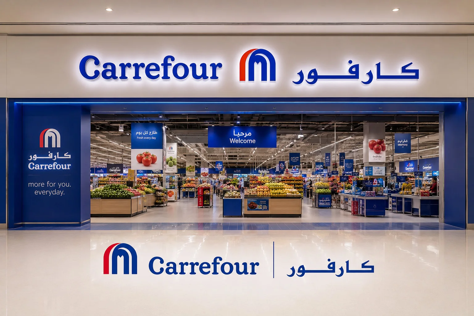
Despite its status as a retail titan in the UAE, Carrefour's digital ecosystem was a landscape of friction. It possessed undeniable logistical strengths: a 60-minute delivery proposition, deep inventory, advanced personalisation algorithms. But the interface masking those features was disjointed. At critical moments in the buying journey, the platform was actively working against the user's intent to purchase.
Over a concise three-week engagement, we executed a comprehensive diagnostic. We didn't just look at screens; we studied behaviour. Through intensive one-to-one interviews, A/B testing, and cross-platform benchmarking, we found a product that wasn't broken, but rather overgrown. Expanded without a governing UX philosophy, it produced an interface that overwhelmed users and ceded ground to simpler, more decisive competitors.
The directive was clear: discover gaps, outline opportunities, and deliver a prioritised, actionable diagnostic. We structured the analysis across four definitive journey stages: Discovery, Decision-Making, Checkout, and Post-Purchase.

Evaluation against established usability benchmarks to identify fundamental interaction flaws.
Assessing Navigation, Content, Presentation and Interaction to measure task completion efficacy.
Categorising and mitigating cognitive friction across Visual, Intellect, Motor and Memory loads.
Moderated and unmoderated sessions in Lookback, card sorting to reverse-engineer mental models, and SUS assessments for quantitative baselining.
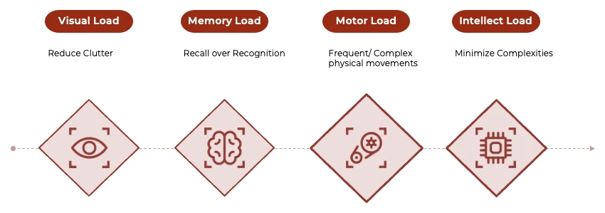
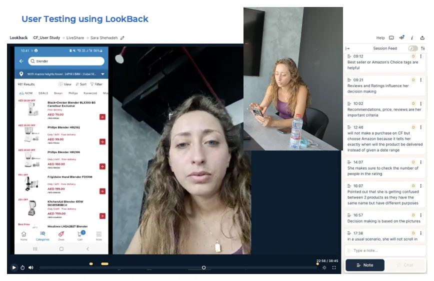
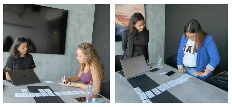
The entry point featured over 40 distinct sections, an overwhelming barrage of deals and carousels. Users exhibited immediate cognitive fatigue, bypassing navigation entirely for the search bar. Critical, high-value features like 60-minute 'NOW' delivery and smart shopping lists were buried beneath the fold, rendered invisible to anyone not actively hunting for them.
"It's too crowded. There are a lot of things that I will never use, like the Bulk Buy. I land and feel overwhelmed."
Participant insight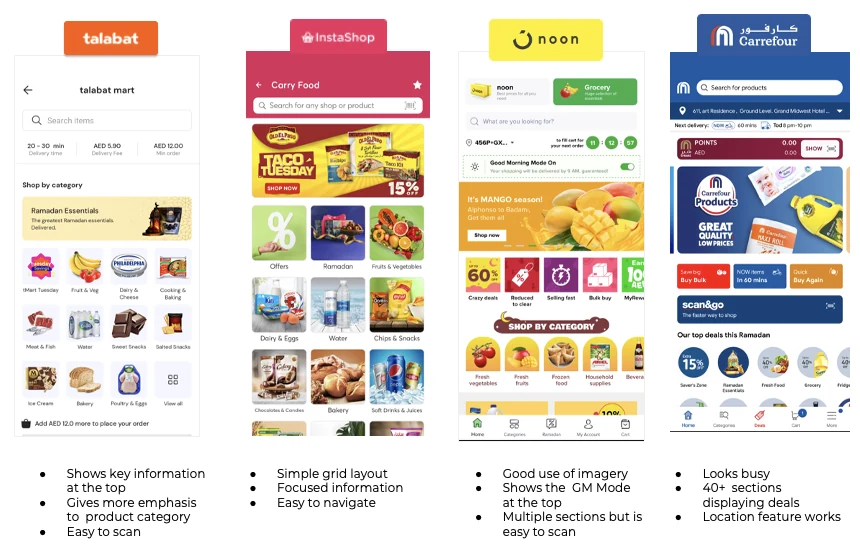
Fast for groceries, but the PDP failed high-consideration items such as electronics and appliances. Generic manufacturer text blocks replaced scannable specs. Crucially, there were zero user reviews or seller ratings.
Impact: high drop-off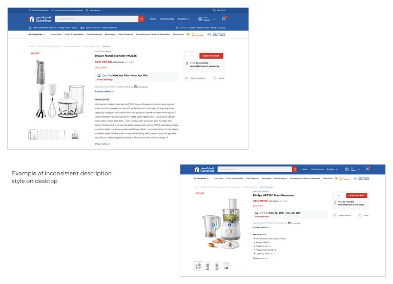
The cart actively discouraged conversion. Red, an alert colour, was the primary interaction hue. Users were forced through duplicate checkout flows, and exact delivery times were absent.
Impact: cart abandonmentThe most severe pain point surfaced after payment. Users routinely spent time curating orders only to receive deliveries with missing items or unapproved substitutions. The default-on substitution toggle prioritised fulfilment metrics over user consent.
Impact: trust and retention"I don't receive half of the products because of unavailability... most of the time you're ordering for that particular item."
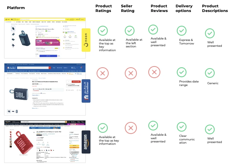
Hisham, loyal userWe presented all six participants with the same product, a JBL speaker, at the same price across three platforms: Carrefour, Noon, and Amazon.
The differentiator was not brand loyalty. It was a single piece of information: Amazon provided a specific delivery date. Carrefour provided a vague range. In digital retail, ambiguity destroys conversion.
Moving from a tolerated utility to a definitive preference required structural change.
Replace the infinite 40-section scroll with two distinct tabs: My Store (hyper-personalised on telemetry and past behaviour) and Explore (a dedicated deals and discovery engine).
Transform the PDP from a text dump into a scannable, graphical interface. Mandate a comprehensive ratings infrastructure: product reviews, Q&A, and seller verification.
Eliminate delivery ranges. Surface precise arrival dates directly in the cart. Introduce a premium tier for user-controlled delivery velocity where logistics permit.
Deprecate the default-on substitution toggle. Replace it with an explicit, push-notified opt-in flow that lets the user authorise or reject specific alternatives prior to dispatch.
A diagnostic engagement demands a different operational rigour than a build phase. The impulse is always to prototype solutions immediately. The required discipline is to dwell in the problem space long enough to ensure you're solving the correct failure point.
The A/B test illuminated this perfectly. Six users, identical products, unanimous defection to a competitor. The intuitive executive assumption might point to brand affinity or pricing psychology. The research proved it was purely mechanical: a vague delivery date versus a definitive one. That is a solvable, systemic problem, and one completely invisible without precise qualitative observation.
Good research makes the correct strategic decisions obvious. The responsibility of a design leader is to ensure the research is rigorous enough to do exactly that.