Credit Suisse · International Wealth Management· 03 / 05
Building premierdigital private banking.
Decades of client data and deep investment expertise, none of it reaching clients in a way that felt modern or trustworthy. We rebuilt the platform for both sides of the relationship, and delivered it in seven months against a two-year industry standard.
Digital Private Banking. Platform walkthrough
Client
Credit Suisse, International Wealth Management division
Deliverable
Digital private banking platform, iPad pilot, responsive web, Apple Watch concepts, design system
Timeline
2014 to 2016
Role
UX Account Lead, HUGE London & New York
Markets
Singapore, Greater China, Taiwan, Malaysia
35%
uplift in user engagement post-launch
7 months
to delivery, against a two-year industry standard
113,000+
man-hours of integration work; featured in Credit Suisse branches globally
01 / Overview
The first tremors of fintech, felt in a private bank.
In 2014, private banking was starting to feel the first tremors of fintech disruption. Wealthfront, Betterment and Nutmeg were proving that digital-first wealth management could be intuitive, transparent and fast. Meanwhile, the digital tools that Relationship Managers at Credit Suisse were using to serve clients worth tens of millions of dollars were, by almost every measure, not keeping pace.
Credit Suisse had the problem most banks had: decades of client data, deep investment expertise, and a global private banking network. None of it accessible to clients in a way that felt modern or trustworthy.
Over two years we designed and shipped a digital private banking platform across four APAC markets: an iPad pilot, a responsive web platform, a full design system, and forward-looking Apple Watch concepts.
02 / The challenge
Two users, one platform, opposite needs.
Private banking is not a single-user product. It is a relationship, mediated by software, between two people with very different jobs. Designing for one at the expense of the other would have produced a platform nobody used.
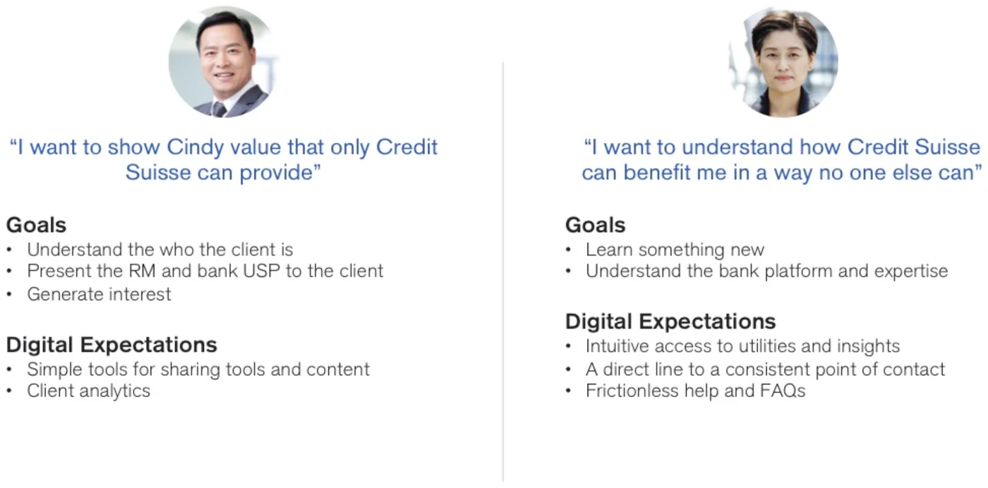
Persona 01
The Relationship Manager
“I want to show Cindy value that only Credit Suisse can provide.”
Managing a book of ultra-high-net-worth clients across multiple jurisdictions, under regulatory scrutiny, with tooling that slowed him down at exactly the moments where responsiveness mattered most. He needed speed, context, and something he was not embarrassed to open in front of a client.
Persona 02
The UHNWI client
“I want to understand how Credit Suisse can benefit me in a way no one else can.”
Net worth in the $15–20M range, financially literate, time-poor, and increasingly comparing her banking experience not to other banks but to every other well-designed app on her phone. She wanted transparency without being buried in it.
Both sides of the relationship, defined together. Each persona carried its own goals and digital expectations, and every screen had to answer to one of them.
Add to that four markets with different regulatory regimes and cultural expectations of what a banking relationship looks like, across Singapore, Greater China, Taiwan and Malaysia, plus a legacy integration surface that would eventually consume more than 113,000 man-hours.
03 / Process
A reverse double diamond, and rare access.
We ran a reverse double diamond: rather than starting from a blank problem space, we started from an existing platform and a set of assumptions already baked into it, then worked backwards to establish which of those assumptions research actually supported. In an environment with this much legacy and this much political weight behind existing decisions, that sequencing mattered.
Research with people who are almost impossible to recruit
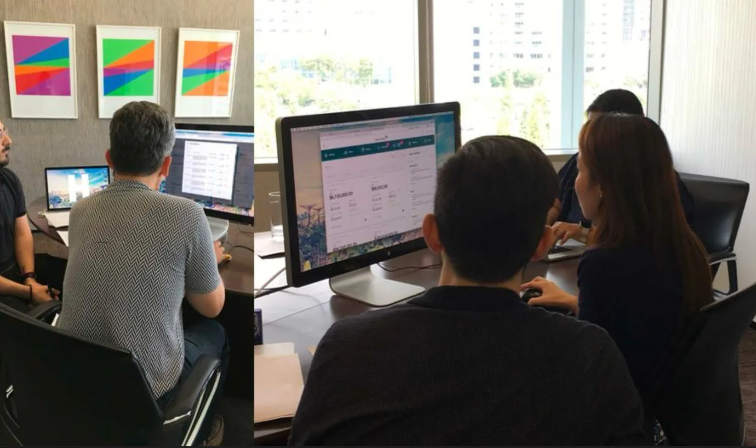
The hardest part of the research was access. Ultra-high-net-worth individuals do not answer screener surveys. Working through a specialist recruiting agency in Singapore, we secured direct sessions with real UHNWI clients, and later usability testing with them on working prototypes.
Testing a private banking interface with actual ultra-high-net-worth clients is extraordinarily rare. Most of this industry designs for a persona nobody has ever met.
Sessions in Singapore. Working prototypes, real clients, real portfolios on screen.
A user summit, not a stakeholder review
On the Relationship Manager side, we convened a summit bringing together RMs from across Singapore, Greater China, Taiwan and Malaysia. It surfaced something a single-market study would have missed entirely: the same feature carried different weight in different markets, and a platform that ignored that would be adopted in one region and quietly abandoned in another.
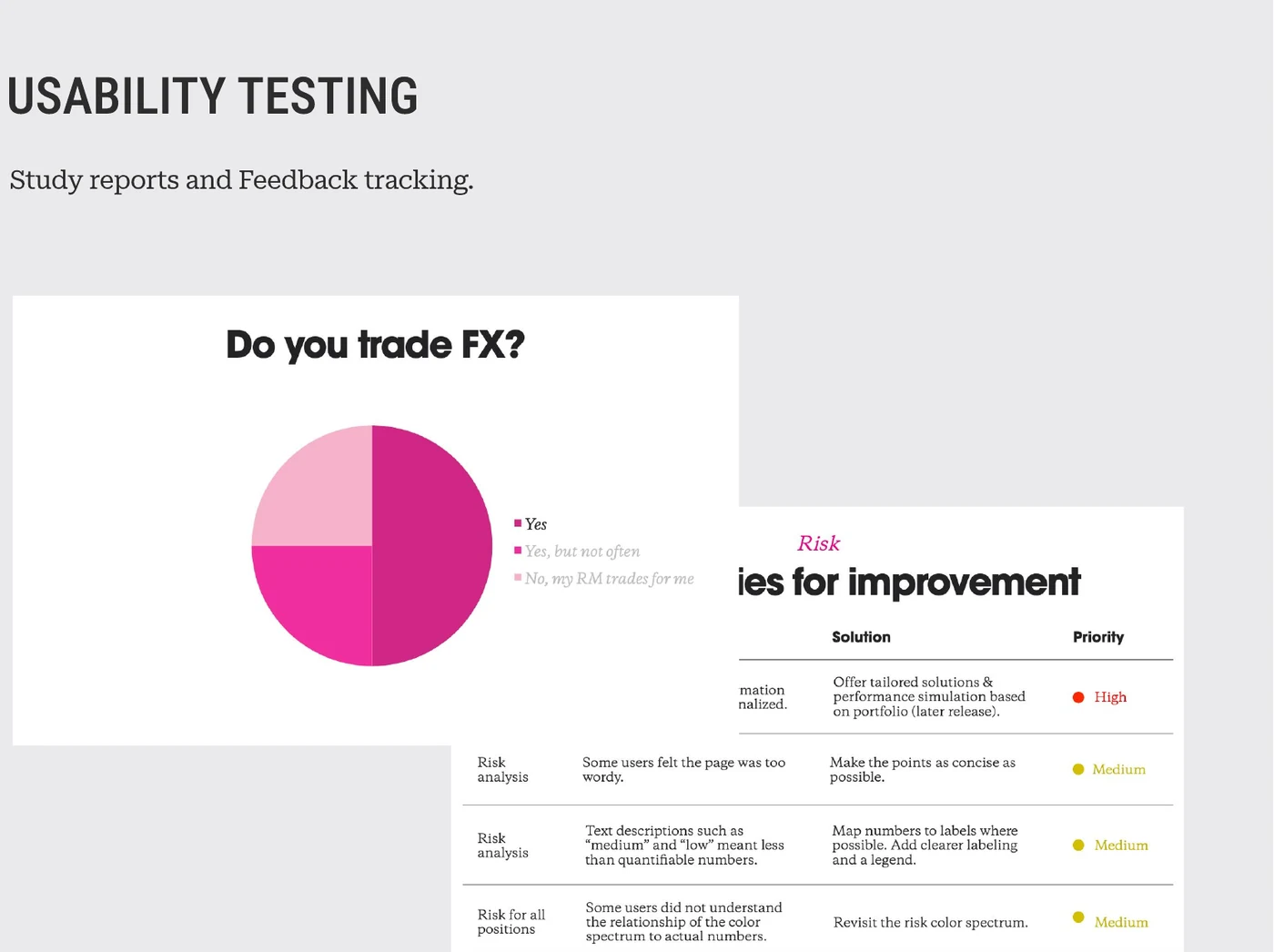
Study reporting and feedback tracking. Every observation became a logged issue with a proposed solution and a priority, so findings survived the workshop instead of dying in it.
Co-creation over specification
For the External Asset Manager dashboard and the underlying workflows, we ran co-creation workshops rather than writing requirements and presenting them back. The people who would live inside these screens every day helped shape their information hierarchy directly.
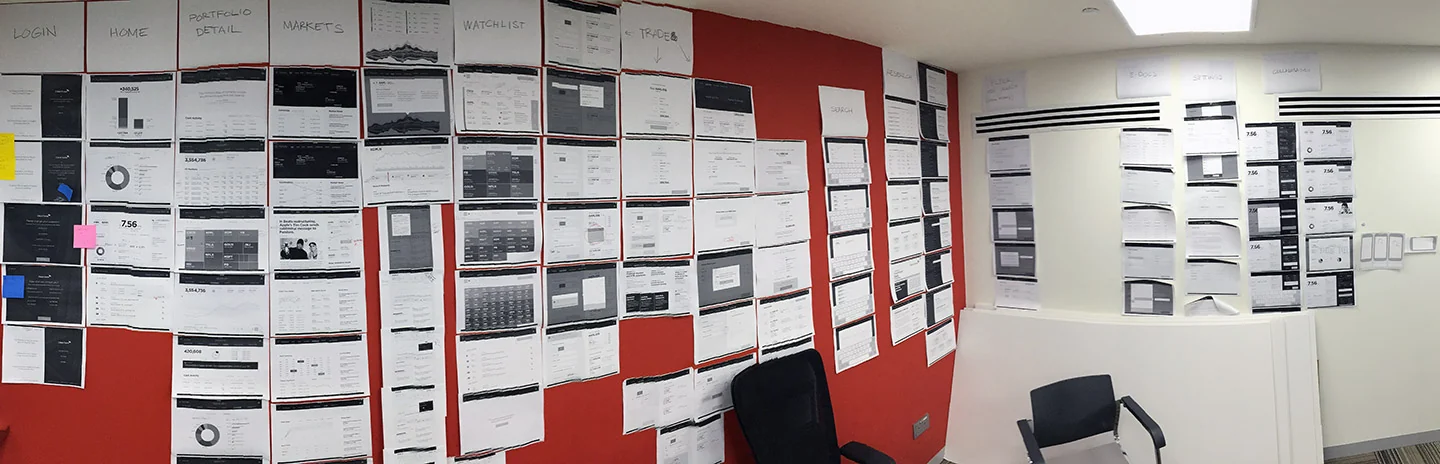
Mid-project: every screen printed and put on the wall. Login, home, portfolio detail, markets, watchlist, trade. You cannot hold a platform this size in your head. Seeing all of it at once is how the gaps and the repetitions surface.
A design library in a single sprint
To hit the timeline, we compressed the design system into one concentrated sprint. A full component library built up front so that subsequent design and build work drew from a shared, agreed vocabulary rather than negotiating every pattern from scratch. This single decision is the largest reason seven months was possible at all.
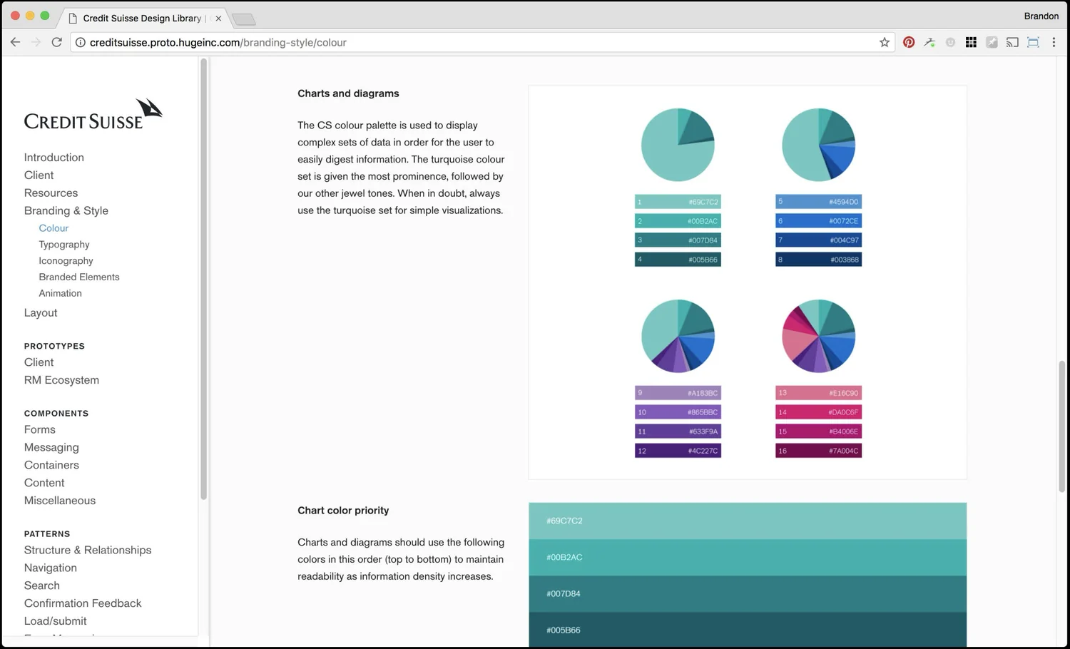
The living design library: colour, typography, iconography, components and patterns, documented and browsable. Chart colour was specified by information density, not by preference.
Phase 01 Pilot
iPad application
A pilot app that let us validate the core relationship model in-market before committing to full platform scale.
Phase 02 Platform
Responsive web re-platform
The validated model re-platformed to responsive web, extending reach across devices and markets without a second design effort.
Phase 03 Forward
Apple Watch concepts
Developed proactively rather than requested, demonstrating where the relationship could go once the platform foundation existed.
04 / The solution
A platform that served the relationship, not just the transaction.
For the Relationship Manager: a dashboard built around the book of clients rather than the product catalogue: portfolio position, recent activity, and the context needed to have a substantive conversation, available fast enough to be useful mid-call. Workflows and the EAM dashboard were shaped directly in co-creation with the people who would use them.
For the client: transparency calibrated rather than dumped. Portfolio performance, holdings and activity presented with the clarity of a well-designed consumer product, without stripping out the depth a financially literate user expects to be able to reach.
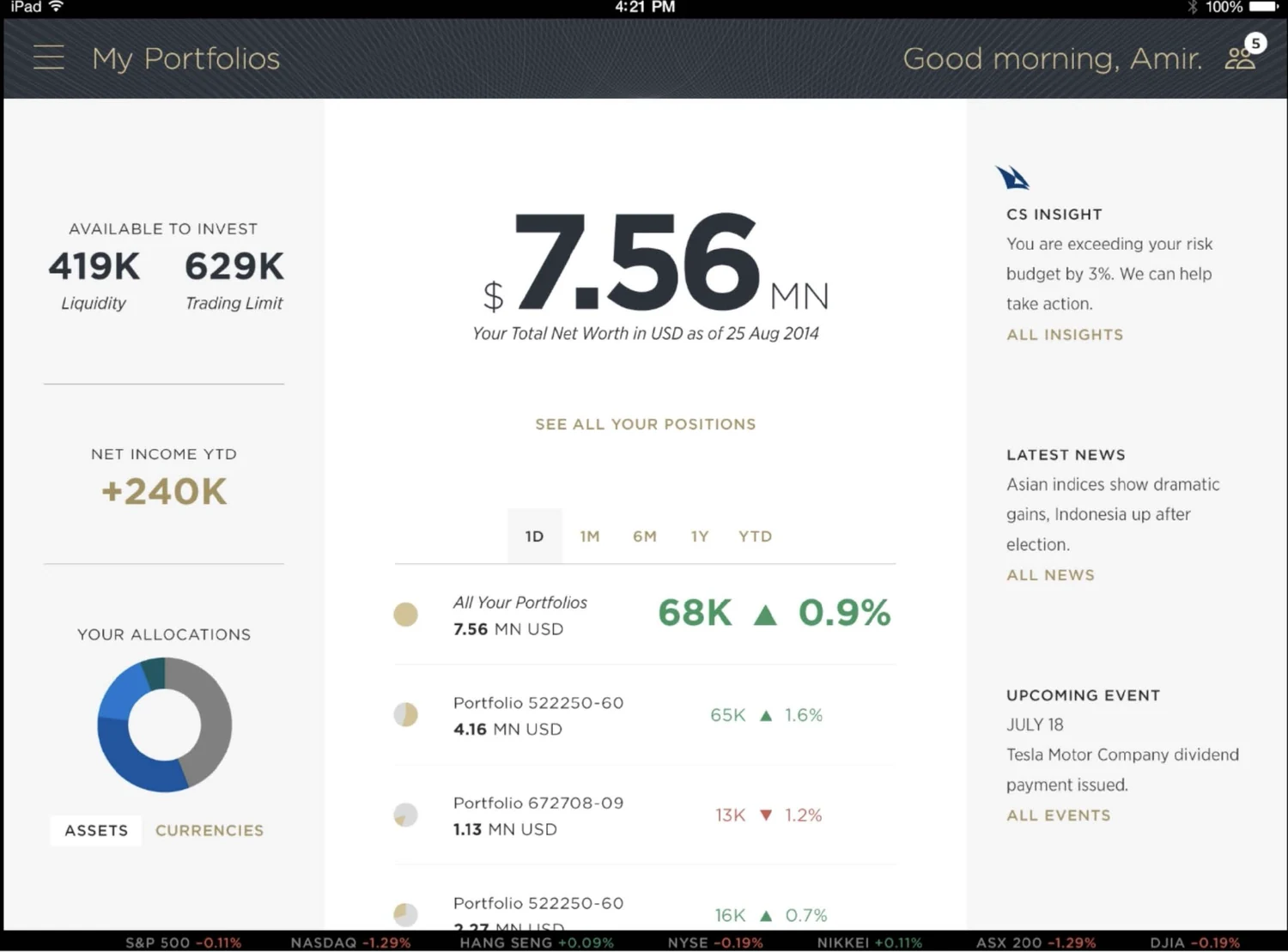
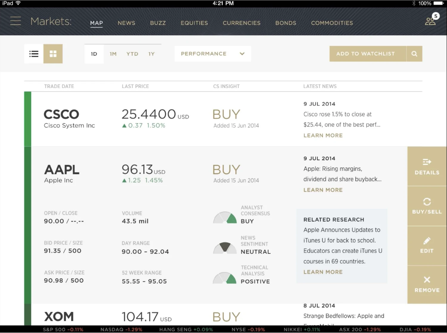
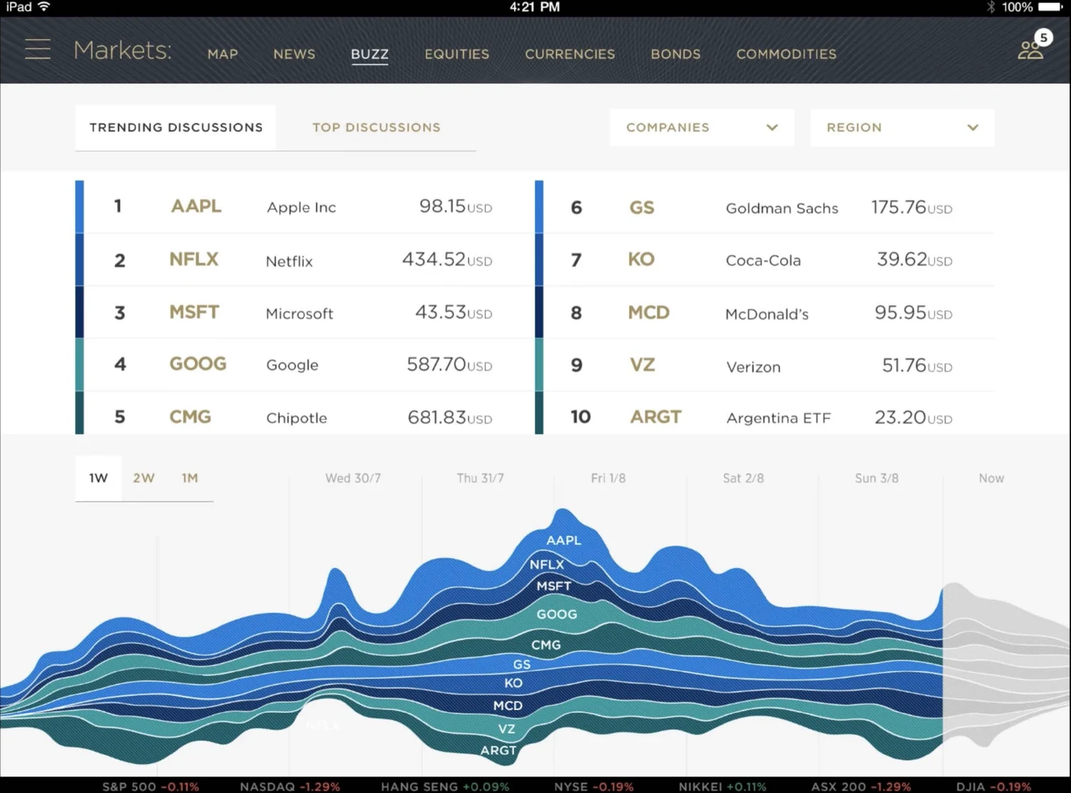
Portfolio overview. Net worth, liquidity and trading limit up front; allocation, positions and CS Insight one glance away.Markets. Price, house view and related research on a single row, built so a Relationship Manager could answer a client question without leaving the screen.Buzz. Trending discussion volume by instrument over time. The kind of view that makes a platform feel like an advantage rather than a statement.
Across markets: a single design system flexible enough to accommodate four regulatory and cultural contexts without fragmenting into four separate products.
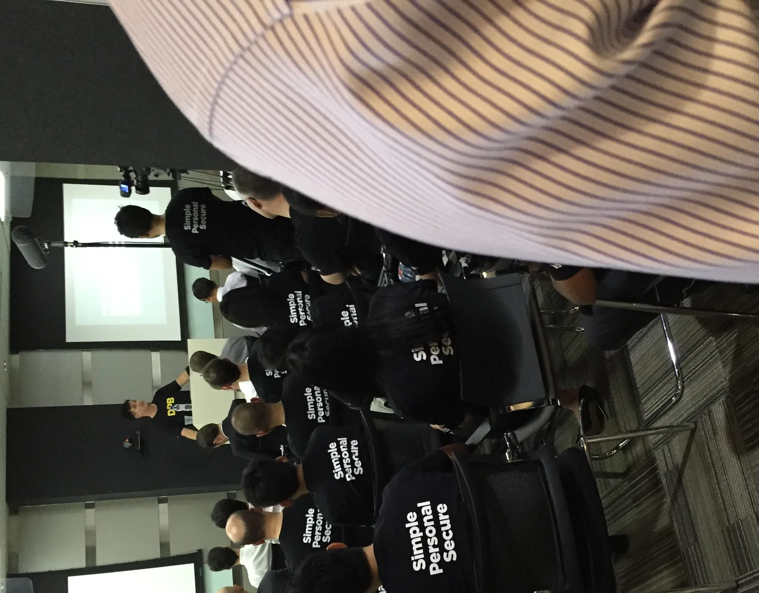
Three words governed every decision on the platform: simple, personal, secure. Short enough that a team of forty could hold them, specific enough to settle an argument.
The platform was delivered as an iPad pilot, re-platformed to responsive web, and supported by a complete design library, with Apple Watch concepts pointing at what came next.
05 / Impact
Seven months, and a platform the bank put on display.
35%uplift in user engagement following launch
7 monthsversus a two-year industry standard
Straits Timespress coverage in Singapore
Globalfeatured in Credit Suisse branches worldwide
Launch, Singapore. The platform shipped under three words: simple, personal, secure, and the whole team wore them.
The engagement uplift was the direct result of grounding every design decision in research and building a shared understanding of user needs with the client from day one, not of any single feature.
The timeline result mattered as much internally as externally. Delivering in seven months against a two-year estimate changed what the organisation believed was possible about its own delivery capability.
06 / Reflection
Design the relationship, not the interface.
The instinct on a project like this is to treat it as a portfolio-visualisation problem. It isn't. The product is the relationship between a Relationship Manager and a client, and the software either strengthens that relationship or gets in its way. Every meaningful decision we made followed from taking that seriously.
The compressed design-system sprint is the tactic I have carried forward most often since. Front-loading the shared vocabulary looks like a delay in week two and pays for itself several times over by week twelve.
If I were running it again, I would push for the multi-market RM summit even earlier. It reframed our understanding of regional difference, and everything designed before it needed revisiting in light of what it surfaced.
Getting access to real ultra-high-net-worth users was the most valuable thing we did. Everything downstream was better because the personas were people we had actually met.
Project delivered at HUGE (Interpublic Group), London & New York, 2014–2016. Case study by Imran Abbasi.